Client
Crate&Barrel
What was delivered
BestBuys Catalog redesign + Tool Kit
Crate&Barrel is a US-based industry-leading home furnishings and accessories specialty retailer. It is known for high-quality design, excellent value and clear functionality.
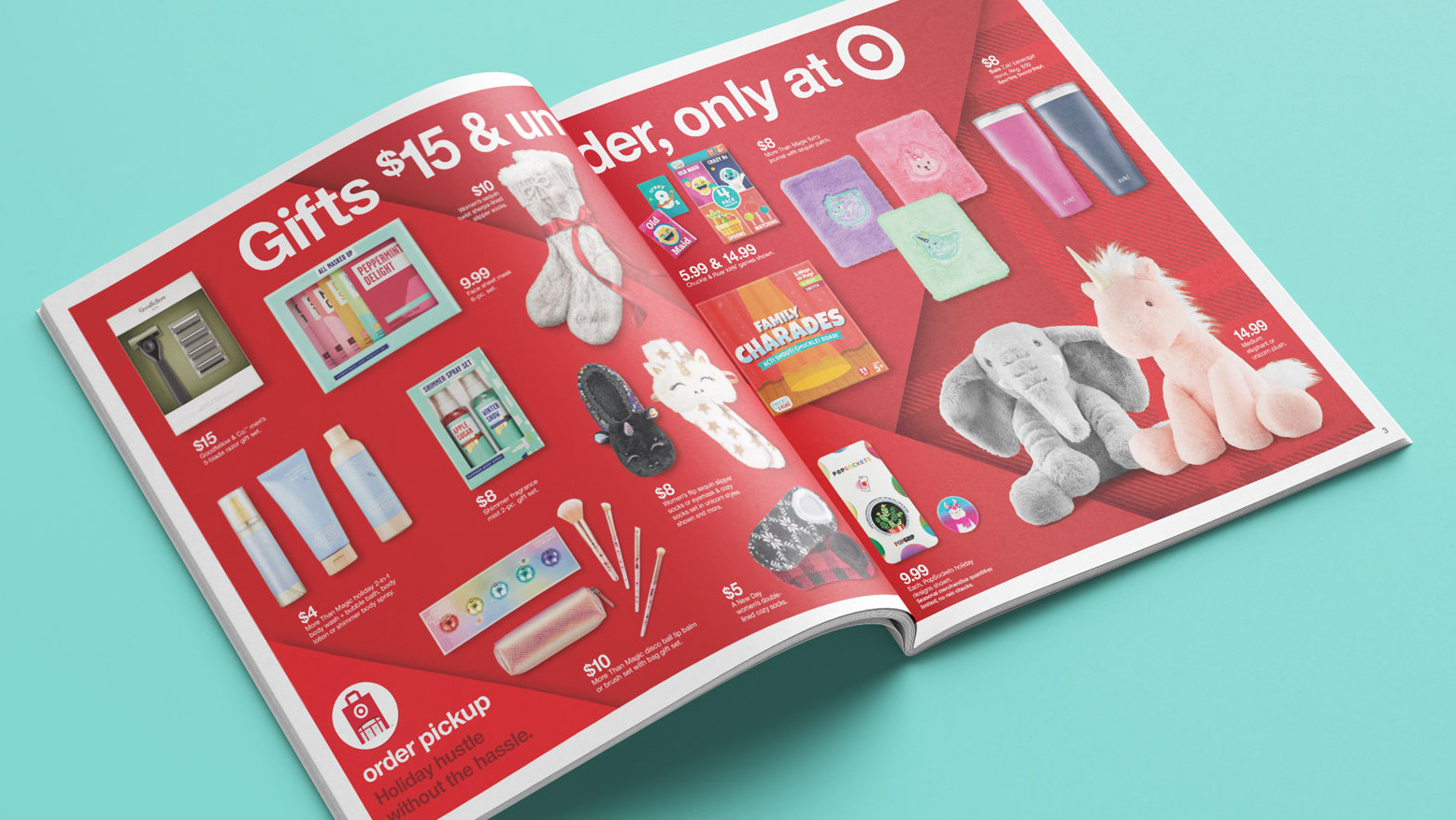
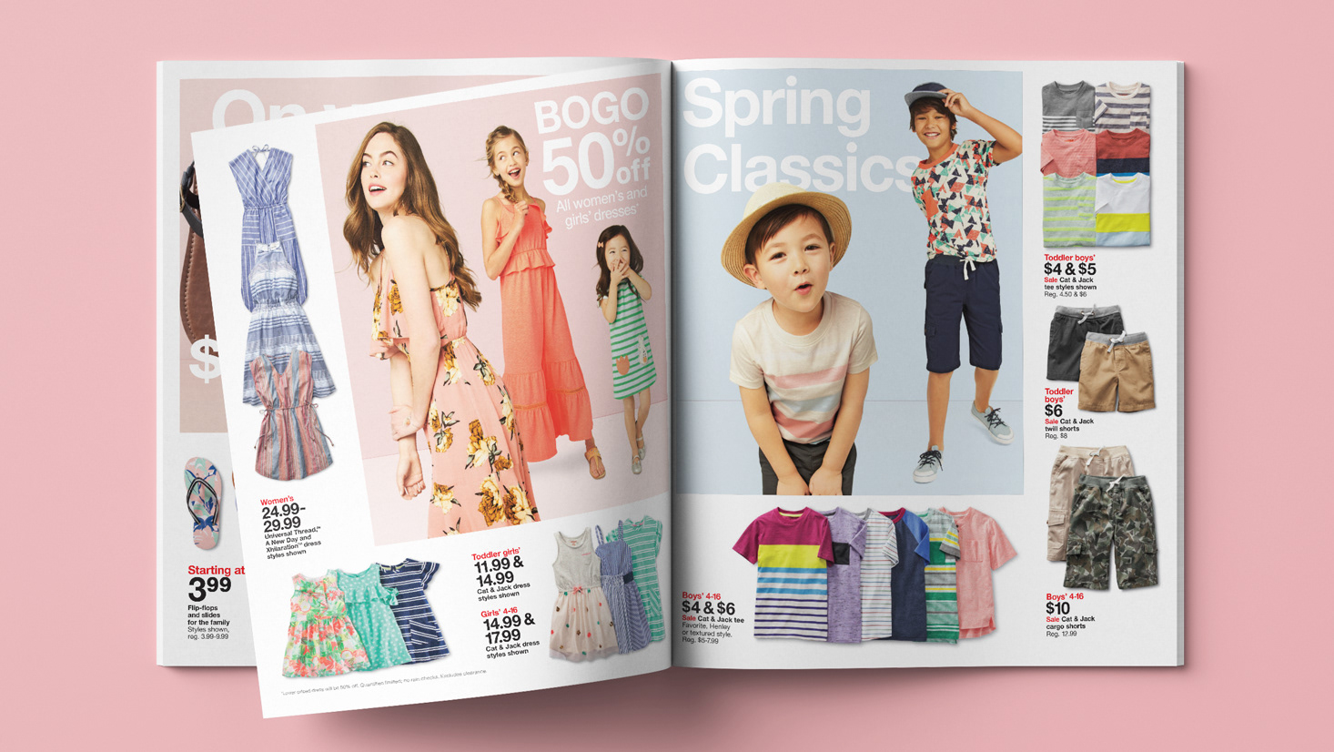
Myself, along with three other colleagues collaborated with Crate&Barrel to help evolve and distinguish its BestBuys catalog from its more upscale and inspirational counterpart. After a marathon ideation session talking through how to best accomplish this we came up with a distinct style and toolkit that showcased Crate&Barrel’s beautiful, well-made products all while elevating their value-price position of the BestBuys catalog.
Style Guide | Tool Kit
Included in the new style guide, select prices were elevated in size and a variable grid was designed (and then broken) to add depth and interest. Promotional messaging and copy tone were also defined.
I designed four of the six final concepts chosen by Crate&Barrel’s creative manager and CMO. These concepts were then used as a benchmark moving forward for Crate&Barrel’s internal team.


